A short history of information design : people, dates and designs
I have wanted for a long time to write down this short history. It is a work in progress as it needs some patient tracking to verify some claims 😉 and it needs to be completed for there are some more important pieces missing !!
I have ranked them in historical order :
Joseph Priestley (1733-1804), England, natural philosopher, theologist, political theorist, and educator. He designed a timeline chart (1765), with bars to indicate longevity of famous people. More info on Wikipedia.

William Playfair (1759-1823), engineer and economist, is credited with inventing data draphics (time series 1786, pie chart 1801, and bar charts). More info on Wikipedia

Charles-Joseph Minard (1781-1870), inspecteur général des Ponts et Chaussées, who is probably E. Tufte’s favorite, is credited with inventing the flowchart to depict Napoleon’s retreat from Russia (1861). More details on Wikipedia.

John Snow (1813-1858), physician specialist in epidemiology, used simple mapping to display statistical evidence from cholera outbreaks to point out the role of water sources (1854). More information on Wikipedia.

Unknown (Touring Club de France). The first documented apparition of a traffic sign was 1894 on the RN7 by Cannes. First designed for people riding bicycle, it quickly proved necessary to organize automobile’s birth. It was quickly made mandatory in Paris (1904) and became an international standard staring 1909 (successive iterations and new signs). More info here, here, here, here and here.

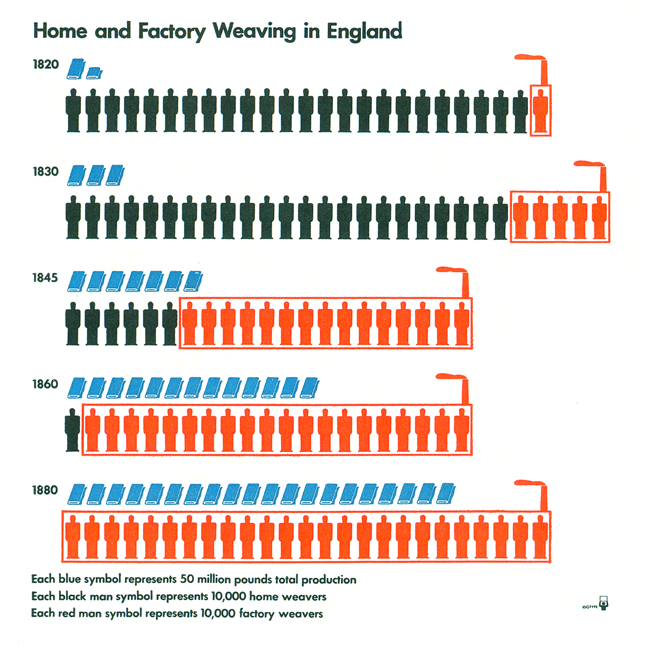
Otto Neurath (1882-1945), philosopher, sociologue and economist, created a system of practical signs (stick figures) to convey quantitative information and formalized his thinking in the Isotype (1930). More information on Wikipedia.
Otto Aicher (1922-1991), graphical designer. He designed the pictograms used for the 1972 Munich Olympics. First attempts had been made at the Tokyo Olympics before but it was Aicher’s pictograms which stayed as a normalized system to describe sports. More information on Wikipedia.

Carl Sagan (1934-1996), astronomer and astrobiologist. He designed with Frank Drake (1930-xx) the so-called Pioneer Plaque. A graphical representation of key current human scientific knowledge was printed on a metal plaque that was sent on the Pioneer spatial probe in search for an extraterrestrial intelligence. More info on Wikipedia.

Susan Kare (1954,xx), graphic designer. She designed the first icons for Apple Computer’s new Macintosh operating system between 1983 and 1986. Those ‘pixelart’ icons together with the graphical interface surely paved the way for the widespread adoption of personal computing. More info on her website and on Wikipedia.

And finally Edward Tufte (1942-xx), statistician and political economist. His contribution to information design can not be yet valuated but judging from the number of the books he wrote and how he is referenced throughout the InfoViz community … More info on Wikipedia.
For more on the history, I have found quite a few papers on the web, starting with this one and this one from the same authors.


I cant’ help thinking of Chan Kim & Mauborgne’s Blue Ocean Strategy. Amaury, you know I’m obsessed by this topic, sorry for polluting your blog with this 😉
One of the key principles of this approach is to “focus on the big picture, not the numbers”. Chan Kim & Mauborgne assert that, rather than painfully preparing a long document to describe and analyze the strategic environment and to come up with a strategic plan, executives should draw a “strategy canvas” (see http://hbswk.hbs.edu/archive/3020.html). This tool not only allows managers to visualize their firm’s current position and strategy : it unlocks creativity and helps to produce a disruptive strategy that is easy to understand and communicate across the company.
P-Yves
August 10, 2007
Hello PYves, you’re right, I should have continued with some more recent knowledge design techniques that were developped for the management world : the strategic canvas, the BCG matrix, … A good idea for a future post !
Amaury de Buchet
November 14, 2007
[…] research paper. Ihave particularly liked this graph, which will probably remind you of the famous “Retreat from Russia” chart beloved by […]
Uswim : You See What I Mean ? » Blog Archive » De-constructing and visualizing complexity : film plotlines and music tracks mashups
September 8, 2008